Portfolio
I-AM Campaign.


Who is the Client and the function?
The consumer for this is for all genders and specifically to young adults and early teens in the UK and US cultural landscape. It aims to create a platform, a publication and a voice that can be shared and used to tell stories and opinions in challenging gender stereotypes. The current changing difficulties of being a girl or a boy and the differences that need to be heard.
What is the format?
I created posters, leaflets and a digital as well as a physical publication.
What was the medium and the practise in design?
My role as Creative Director and Producer of this campaign, I have been collaborating with a team of creatives. You will find credits below, I collaborated with a photographer, a stylist, an assistant and models in capturing my vision. Capturing the different characters.
What are the key themes to this artwork?
The key themes explore 3 different subjects in mind to challenge gender stereotypes, the beauty queen, focusing on the dark secret of the Beauty industry and the impact on feminist movements and the life for young girls under this influence. The nerd, considering toxic masculinity and leading spychologists on how to tackle this issuer. The third and final, The queer power stand, in connection to the LGBT community, media representation and women finally wearing the trousers.
Where did I get my content from?
I interviewed educators, creatives, urban communities and young individuals on their story and living experiences growing up with labels and gender roles. I created case studies and content to match these examples to written content.
what was my favourite interview?
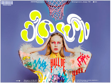
Our model Rebecca Taylor, a mysterious beauty who works in the modelling industry. I asked her to send me her interview with several questions I had prepared. Little did I know, she is representing Women’s National Basketball teams in Universities and across festivals in the UK. Showing the sports world that there is so much more to a person than what they look like. This power stance to be treated equally in work, sports and culture.

What was the process?
The first deep understanding of the issue being solved and the client, looking into developing contemporary practise and their creative and contextual relationship in this being effectively communicated.
The exploration of design such as the TYPE ONE publication reflecting urban street culture in typography and how I readapted this.
The focus of text and and image and the effectiveness in being communicated.
Why is the process so important?
When given a brief there is a need to focus on understanding the vision not from my own creative perspective and preferences but being influenced and directed to create vision that speaks truthfully to what is needs to be. To be authentic, truthful and accurate.


Collaboration —
Photographer - Beth Pulley
Stylist - Laurie Gautier
Models - Jonny McGarry
Lilly McGarry
Rebecca Taylor
